These maps are an excerpt from a study commissioned by SNV-Burkina Faso in 2022 on agricultural encroachment in two pastoral reserves in Burkina Faso- Sondre Est and Niassa (Both in the Zoundwéogo Province) using satellite imagery from the Sentinel 2 Satellite. The results of the study indicate a significant expansion of cropland within the boundaries of both protected livestock reserves between 2016 and 2021.
Cropland Expansion in Sondre EstCropland expansion in Niassa
These maps are an excerpt of a study performed earlier this year to analyse cropland changes in several areas of interest across the Sahel: Abadam (Nigeria), Magumeri (Nigeria) and Bani Bangou (Niger). Specifically, the idea was to use freely available satellite imagery to assess changes in cropland in areas that are difficult to access (mostly due to security constraints). The study used imagery from the Sentinel 2 Satellite that was processed by the 3 Period Timescan (3PTS) method on Google Earth Engine. For an introduction to that method, there is a paper and video available.
For the short version of how the method works: 3PTS uses Sentinel 2 images to create a 3 period NDVI profile over the course of a growing season. Given it’s unique NDVI profile over the course of the three periods, cropland can be easily distinguished from vegetation types. For each area of interest, we compare the most recent image of cropland (from the 2021 growing season) to the reference image of the 2016 growing season.
This map divides Abadam into equally sized hexagons and each hexagon is classified into categories representing the cropland change, as seen from the 3PTS images.
In a further step, the population of each hexagon is calculated using the Facebook High Resolution Settlement layer. This allows us to see the proportion of Abadam’s population living in areas with noticeable changes in cropland.
The table above shows a deterioration of crop conditions in the irrigated zone (NG07) and relatively stable situations in the other two LHZ. However this deterioration is not uniform across the zone. Of the 212 zones containing cultivated surfaces (290 hexagons had no crop landcover whatsoever), 81 saw an increase in cropland since 2016, whereas 64 saw a loss. Among those 64 zones, 34 had a complete loss of all cropland. While at face value, this seems to indicate an improvement in food security outcomes, this is no longer the case when population is accounted for. Analyzing the hexagons by their population , a much larger share of the population can be found in areas experiencing cropland losses. An estimated 25% of the population can be found in areas with cropland losses, and 16% of them are in areas with a total loss of cropland. Only 13% of the population lived in zones with increased cropland. 20% of the population lived in zones with stable/unchanging cultivated surfaces.
It is also worth noting that 42% of the population were found in zones with no cultivation whatsoever. For many, this indicates that they were unengaged in significant agricultural activities- this hypothesis is reasonable, considering the significant population concentration in the towns of Abadam and Mallam Fatori (around 22% of the population) and the significance of fishing and livestock herding in the area. That said, it is reasonable to assume that a number of the people living in zones with no cultivation are farmers who live a long distance from their fields, which is a common occurrence. Thus a number of people in the area may live in a different hexagon from their fields.
In 2020, I looked at 3 publicly available rainfall datasets- IMERG, CHIRPS and ARC2 and compared their accuracy against ground station data from several locations across North and Central Mali. I’ve put the writeup and results here for anyone interested in reproducing the analysis.
An archive of CHIRPS, ARC2 and IMERG data was used, having been resampled and reprojected to the same resolution (10km). These were compared against station data downloaded from Tutiempo (https://en.tutiempo.net/climate/mapa/) and the NOAA ground station database . Full-year dekadal station data was acquired for Mopti (2015, 2016,2017), Hombori (2010,2011) and Gao (2009)
Station data for Mopti and Gao was downloaded from the Tutitempo service and used to compare the three satellite datasets. The Hombori data was acquired from the NOAA’s ground station database. The Mopti dataset contained the least number of visible errors. Both the Hombori and Gao station data contained several gaps. Numerous gaps in data are observed for Gao station throughout the season that do not seem to follow regular rainfall patterns. As a result, dekadal observations for Gao station may not be valid. However, the seasonal total of 269mm recorded for Gao is on par with observed averages for the cercle of Gao. As a result, while the study takes into account the results from Gao and Hombori, the Mopti data forms the core.
Method
The coordinates of each station was placed against a raster-stack of each dataset. A dekadal timeseries for each dataset was created for the single pixel containing the station’s coordinates. These were compared by dekadal and seasonal totals.
Results:
ARC2 was the most accurate of the datasets for both seasonal and dekadal totals.
In terms of rainfall quantity, Arc2 seasonal totals had a 99% accuracy compared to the Gao station data and generally high accuracy for the Mopti station, with the exception of 2017, in which CHIRPS data was considerably more accurate. The Hombori station data was found to be closest to CHIRPS’ seasonal estimates. The IMERG dataset was the least accurate in seasonal totals. Rainfall was vastly overestimated for all sites. It is worth noting that only the Mopti station estimates are considered fully reliable.
Error of seasonal totals compared to ground stations:
Seasonal totals by dataset (mm):
Both ARC2 and CHIRPS were each the most accurate dataset for three periods.. However, given that the Mopti station data is more reliable, ARC2’s higher score here indicates a better accuracy. As a result, ARC2 is considered the most accurate dataset in terms of seasonal totals.
For Mopti Station, ARC2 totals were generally on-par with station-level observations for Mopti station, mimicking the dips and rises. CHIRPS’s totals follow a much smoother profile, however they do not reflect the dips and rises of the dekadal totals of mopti station. Even in the 2017 period, where CHIRPS seasonal totals were closest to the ground data, a decline can be observed in CHIRPS totals from dekad 083 until the end of the season which is not reflected in the ground data, or any other dataset. IMERG data significantly overestimated dekadal totals, showing multiple peaks at double or triple the value of any other observed dataset. Likewise multiple peaks were registered (such as 2015083, 2016073 2017072 that were undetected by any other dataset.
For Hombori, both CHIRPS and ARC2 follow similar trends, with ARC2 overestimating and CHIRPS giving generally more conservative dekadal totals. IMERG is very clearly the least accurate of datasets here. However the distinction between ARC2 and CHIRPS is difficult, given that CHIRPS seems to perform more accurately in 2011, whereas ARC2 seems to mirror the seasonal peaks more closely in 2010. CHIRPS does seem to be the more accurate rainfall dataset here, given that the seasonal totals are likewise much closer.
For Gao, the station dekadal totals seem to be unreliable, as the station recorded an abnormally high rainfall of 150mm in the first dekad of the season (Second dekad of May) of 150mm and no 0 rainfall until the second dekad of June. This points to a likely error (no additional sources confirmed such high rainfall).
While ARC2’s seasonal totals were remarkably close to the station’s readings, the dekadal totals do not show a strong match. No dataset seems to mirror the station’s dekadal totals, indicating a likely error.
Correlation Coefficient against ground data by dekad
The chart above shows the correlation coefficient between all three satellite sources and station ground data. Gao was not included due to its unreliability. ARC2 is most strongly correlated with dekadal station values for both sites (though the margin is quite close in Hombori).
Conclusion:
Based on comparisons with station observations, ARC2 is the most accurate of the three datasets. ARC2 performed the most reliably with the most reliable of stations- the Mopti station. Likewise the dekadal totals were the most accurate of the three. Dekadal accuracy should be prioritised over seasonal accuracy, given that pastoralists will most likely need rainfall data early in the season. ARC2 should be recommended for use with the GARBAL interface.
This is easily one of the most bizzare maps i’ve made- each US congressional district boasting a candidate who has publicly declared to believe in the Qanon conspiracy theory as of July 2020.
A cartographic change on the work I did with Action Contre la Faim mapping biomass. This map uses contrasts to highlight the agro-pastoral zone (seen here in Purple). The map was also designed to be colourblind-friendly.
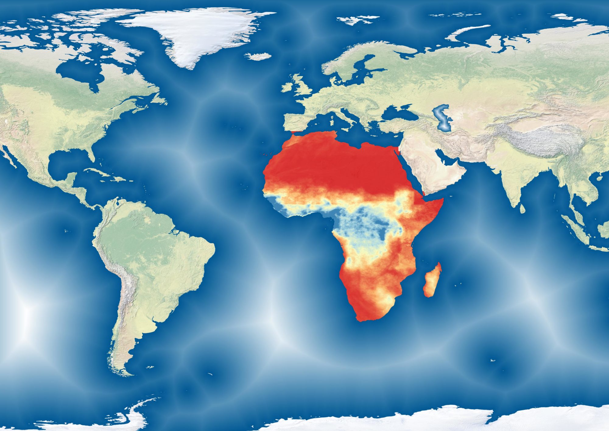
These rasters show recurrent biomass deficits in West Africa between 2015 and 2019. The idea is to show areas at risk of desertification by focusing on recent years of continued degradation. Desertification as a concept has a number of different definitions, many of which are divergent. As a result, this dataset and map may not fit within a specific user’s definition of choice. The goal of this map is not to offer a new definition of desertification or to provide a new lens with which to view it. Rather, the idea is to highlight areas where biomass production is suffering from multi-year degradation.
For remote workers, Dakar offers a few places where you can post up with your laptop for a few hours. The map above shows co-working spaces, hotels and cafes that can be decent workspaces with basic criteria: large tables, outlets and the kind of atmosphere where you can get work done (not too crowded or noisy).
Click on the points to get more information about them.
Most of these places have internet, but you’d be advised to hotspot your phone in any case, since the connection can get spotty.